Most people think of us as a web company, We have created a number of…

Responsive Design: WordPress or NOT?
“Responsive Design” is a popular topic in the web design field these days, and a big business builder for designers and programmers. But what does it MEAN FOR YOU?
Responsive Design lets a single version of a website adapt to each device’s resolution and show a “most appropriate” version suiting each device and its typical audience. This recognizes that both the audiences and their needs & priorities can be VERY DIFFERENT on different devices. That means businesses need to consider not the just form-factor (how content, menus, and navigation may change), but the actual content may change.
To view Responsive Design in action, click on the right margin of your browser window (the cursor will look like a two-headed arrow) and start dragging the right margin toward the left side of your monitor, to see how different screen and tablet resolutions are displayed, until you get down to roughly the width of a smartphone screen. Do this for the top of the screen, the middle of the page, and the bottom (footer) to observe how elements and display of those elements changes before your eyes. No only is this process fun, but it is informative as well.
A Quick Technical History
In the early days of the internet (around 1999, think “Y2K”) monitors where typically 800 x 600 pixels, and they slowly got larger, where today monitors with 2000+ pixels across of resolution are not uncommon. Web design adapted to enabling users to take advantage of not just larger screen sizes and better color and faster monitors.
By 2007, Blackberry offered mobile computing (mostly text) and the Apple iPhone made the web truly mobile, and designers had to create mobile versions of websites or program mobile “apps” to reach those consumers. Click-to-call features were added for smartphone websites.
Since 2010, Apple as sold many millions of iPads and made tablets common household devices. Designers typically either send the low-res tablets to the mobile site, and the hi-res tablets to the desktop site.
The rise of Android means that “apps” for just one platform are no longer an option, and the dominance of Google has made Apple switch its default search to Bing, as challenged the “only Google” focus of many SEO companies.
Why WordPress?
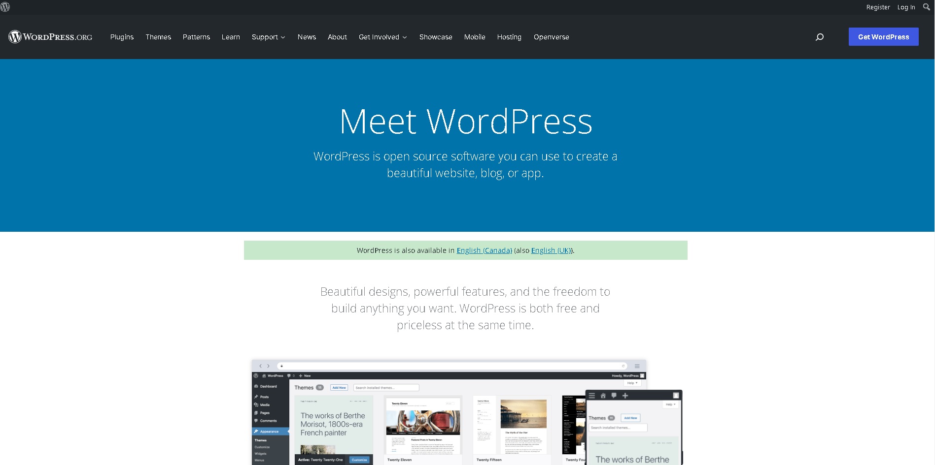
WordPress was originally develop as a “blog” software platform, but its ease of use and wide audience helped it to evolve as a web toolkit for less-technical users, with various individuals and companies creating templates, plug-ins and tools that make many features—which used to require a programmer or code—as simple as “drag-and-drop” (many either free or at a nominal cost). WordPress coincidentally also developed as a responsive platform, suitable for desktops, laptops, notebooks, as well as smartphones and tablets.
While it looks like WordPress may be a one-size-fits-all solution, it has a number of downsides and limitations:
1) Too much choice and too many options
2) Technical support is hard or impossible to get (when the tools are free or cheap, what are the economic of this?) and learning curves are long and steep
3) There is massive code bloat (more on this later) which makes sites run slow
4) Emphasis on “pretty” means websites are slow to load because of massive image files (often not resized or compressed)
5) The number of files needed to make WordPress have a negative impact on your SEO: not only does the site run slower, but the lines of code on a page before real content both have a strong adverse impact on your website’s ranking on Google (and Bing)
6) Content on a page cannot be dynamically changed to suite different platforms needs or priorities: the content is The Content
FoundLocally is in the process of converting all of its websites to Responsive Design, and have completed two sites, http://MovingInCanada.com and http://TransCanadaHighway.com (as well as some client projects moving to responsive versions).
Our flagship site http://FoundLocally.com’s conversion is still underway (we’ve got over 100,000 pages of content so it takes a little longer!).
Files Sizes and Webpage Loading
We have noticed that WordPress websites require over 1.5 megabytes of CSS files and JavaScript (JS) files to be loaded, in addition to the actual webpage file. This MASSIVELY slows down the site on smartphones. And these files are all necessary for the various plug-ins and tools installed into the website. And on your webserver, the WordPress installation may have thousands of files just to provide images, templates and functionality—most of which are never used or displayed in your websites.
For a good example in the public domain, try downloading http://CalgaryHerald.com (shown above)—which uses a special WordPress VIP template—on your desktop (which typically uses a Shaw or other hard-wired internet connection), on a tablet (which typically uses a relatively fast WiFi connection), and finally on your phone (which may use your WiFi or your provider’s data plan). While their responsive design is well thought out, it’s glacially slow on a smartphone.
The FoundLocally sites have custom-written CSS and JavaScript which we’ve optimized to load in under 40kb in addition to what’s in the webpage. This allowed the sites—which are dependent on advertising revenues—to load really fast, allowing more time for the ads to display and be clicked on… without the ads, our sites would run even faster.
The Web Page Itself
On the web page itself, one thing I do is a “View-Source” review (this is in every browser’s menus) and look at three things:
1) is the META tag coding up to current Best Practices
2) what percentage of the page is viewable text (not hidden code or programming)… use a highlighter to mark the visible content on the printout
3) Look for key Google tags: <TITLE, <DESCRIPTION and <H1 and how far down the page are these found? How far down the page is viewable content (previous point). Anything past line 100 is BAD!
How Fast Does it Load?
To see how fast a site is running, use the Google Developers’ page Speed Iinsights tool. Be sure to do this on competitors’ sites (that may otherwise look good), as well as on any sites offered by web developers as part of their references/portfolio.
Like in school, under 50 is a “fail,” 50-60 is passable, 70 is good, 80 is great,and over 90 is really commendable.
Not all of Google’s recommendations are actionable, but they are part of a good conversation about optimization. The mobile rating also includes a User Experience rating, to gauge its smartphone friendliness.
In Conclusion
So, to wrap up, some recommendations for current Best Practices of web design :
1) Responsive Design is a must
2) Use tools and coding (and/or consultants) appropriate to your budget, in-house skills, and time-frames
3) Consider your audience’s needs and priorities on different devices
4) Look at SEO measurement tools to ensure the new site is going to rank well (or at all) on Google & Bing. Tweak, tweak, tweak!
Is WordPress an option? YES, for the do-it-yourself crowd, and for clients who want to update their own site after its “done” or want to post a blog on their own website they way they currently post to Facebook.
Is WordPress always the best answer? Not always, and in some cases, not often. Especially if you are concerned about speed, and if you want different user experiences on different devices.


