Mobile Websites
Reach Your Customers On The GO!
Mobile Website Design
Can Help Grow
Your Business
Mobile Website Design Can Help Grow Your Business
There are billions of mobile phones and phone users around the world,and hundreds of thousands right here in Calgary. To reach them, you need a Mobile Website Design, created by our Calgary Web Designers. We can help you plan, develop and build a full-functioned mobile & desktop website that can:
- Attract new customers and markets Increase business with existing clients Introduce new products or services more effectively Provide quick access to helpful information about your company Optimize mobile users’ ways to connect with you quickly: Maps, Phone, Email, Feedback, Business Hours, List (and details about) your Products and Services, Links to Articles, RSS feeds, Facebook and Twitter, Integrate Coupons with Special Offers, add QR Code Marketing on your facilities, vehicles, uniforms, and print collateral Integrate with your Social Media: Facebook, Twitter, LinkedIn, Pinterest Traffic Stats
See samples of Mobile websites below or in our Portfolio
Today’s users are
1/4 desktop
1/2 smartphone, and
1/4 tablet
Who can AFFORD TO IGNORE any of these audiences?
Over a decade experience with mobile and responsive design
TransCanada FoundLocally has been working with smartphones since the first iPhones, back in 2010. We skipped the “Blackberry app” circus (which were highly limited, even “crippled” versions of website data), choosing to focus on web-first mobile and then shifting to fully-responsive website design which worked on all devices.
Responsive Websites for Smartphones, Tablets, and Desktop
In the early days of computers and the internet, there were just desktop PCs and slightly smaller laptops. And in the REALLY early days, you were limited to 800 pixels across of screen size (in the “Y2K” era).
Over time, monitors got larger, screen resolution improved, and sites were adjusted to 1000 pixels, 1200 pixels, 1600 pixels and now even larger. As the internet got faster, images could be larger, and full-screen video can be streamed.
The smartphones were invented, with smaller screens but gave full internet functionality on-the-go. They came with a variety of proprietary platforms: Blackberry, iPhone, Android, and Microsoft Windows versions. With the smaller screens, often web interfaces were greatly abbreviated to fit. and interfaces need to be touch-screen compatible, with large clickable buttons. In the early days of smartphones, many companies developed “apps” tfor each device or platform,, but having multiple apps was superceded by mobile web interfaces, using the browsers that already ran on each device. And over time smartphone screens got larger, Facebook innovated their a smartphone “app and their content evolved into a forever scrolling page (until the user got bored or ran out of time). On the desktop, Pinterest had a similar design metaphor: a waterfall of content that users can scroll down forever, to view more content.
Tablets, with only a touch screen interface, filled a middle ground: a laptop-sized screen, and a touchscreen interface like smartphone. Users can hold it “tall” like a book, or turn it “wide” like a movie screen. Most accessed the internet through a fast WiFi connection.
Instantly, users demanded larger images, better interfaces, and the smartphone/desktop interface divide was out the window. Responsive design was now “in”.
Today’s users are 1/4 desktop, 1/2 smartphone, and 1/4 tablet
Even email marketing has evolved!
As many as 2/3 of all emails are opened up on a smartphone, its important to design emails to be responsive. And its crucial that the websites they link to be fully effective on a smartphone or tablet. “Crippled” mobile website content or functionality will kill your business. And emails have gotten highly visual, just like the websites they link to.
QR Codes
Reach Your Customers On The GO!
How can a QR Code help with mobile marketing?
QR is short for “Quick response” and is a way to get mobile users to link to your mobile website, a specific product page, or a mobile-friendly response form without requiring them to remember or type a website URL.
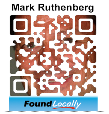
QR Codes are those square graphics, typically black and white (example above), that can be scanned by a smartphone using its camera, which redirect users to a website or a message (example below). There is not need to QR code to be boring square, or to be just black & white. We’ve done a numb er of QR codes in all sorts of colours and designs for Calgary companies
Examples of effective QR Codes:
A realtor can have a QR code for a specific home on their “For Sale” sign A store can use QR codes as shelf tags to send in-store shoppers to their website form more product info You can have QR codes on your door out, to encourage users to post reviews on sites like Yelp, FoundLocally.com, Google-Business, and TripAdvisor.com. A billboard can have a link to your website, A magazine ad can have a link to the webpage about the product advertised.
We have worked with various companies to create smart innovative and unique QR codes that reflect their corporate personality:
More QR Codes, see TransCanada FoundLocally’s Pinterest page
QR codes should be 1/10 the height of the distance away from viewers
Responsive Website Design Portfolio
Some Responsive websites in our portfolio:

