Responsive Website Design
Websites accessible on all devices!
Today’s users are
1/4 desktop
1/2 smartphone, and
1/4 tablet
Who can AFFORD TO IGNORE any of these audiences?
Over a decade experience with mobile and responsive design
TransCanada FoundLocally has been working with smartphones since the first iPhones, back in 2010. We skipped the “Blackberry app” circus (which were highly limited, even “crippled” versions of website data), choosing to focus on web-first mobile and then shifting to fully-responsive website design which worked on all devices.
Responsive Websites for Smartphones, Tablets, and Desktop
In the early days of computers and the internet, there were just desktop PCs and slightly smaller laptops. And in the REALLY early days, you were limited to 800 pixels across of screen size (in the “Y2K” era).
Over time, monitors got larger, screen resolution improved, and sites were adjusted to 1000 pixels, 1200 pixels, 1600 pixels and now even larger. As the internet got faster, images could be larger, and full-screen video can be streamed.
The smartphones were invented, with smaller screens but gave full internet functionality on-the-go. They came with a variety of proprietary platforms: Blackberry, iPhone, Android, and Microsoft Windows versions. With the smaller screens, often web interfaces were greatly abbreviated to fit. and interfaces need to be touch-screen compatible, with large clickable buttons. In the early days of smartphones, many companies developed “apps” tfor each device or platform,, but having multiple apps was superceded by mobile web interfaces, using the browsers that already ran on each device. And over time smartphone screens got larger, Facebook innovated their a smartphone “app and their content evolved into a forever scrolling page (until the user got bored or ran out of time). On the desktop, Pinterest had a similar design metaphor: a waterfall of content that users can scroll down forever, to view more content.
Tablets, with only a touch screen interface, filled a middle ground: a laptop-sized screen, and a touchscreen interface like smartphone. Users can hold it “tall” like a book, or turn it “wide” like a movie screen. Most accessed the internet through a fast WiFi connection.
Instantly, users demanded larger images, better interfaces, and the smartphone/desktop interface divide was out the window. Responsive design was now “in”.
Avoid the 3 Biggest
Mistakes With
Mobile Websites
3 Biggest Mistakes Companies Make With Mobile Websites:
1) Mobile gets lip service
Use only a “desktop” web site, but support it with Google Ads and QR Codes that send mobile users to your annoyingly inappropriately sized desktop site.
You need to have a mobile website as well, and have your server “auto-detect” the user’s device and send them to either the desktop site (for laptops and tablets) or the mobile site (for smartphones)
2) Mobile functionality is crippled
Many website designers do a token 5 or 6 page mobile website, which is not a full-featured site like your desktop website. Mobile users make decisions (and tend to be more affluent than clients that don’t use smartphones), and you should guide them through your sales & decision process too. They just want to do it while way from their desk (a ball game, a park, at launch with business associates, at the bar with friends)…
Give them ALL the information that’s on your desktop website
3) Site content is not optimized for smartphone users
It’s not just about the size of the screen, and large buttons for tapping. The website navigation changes, and needs to be on the bottom of the pages (so it doesn’t crowd out the content people are navigating to read). And content needs to be redesigned (for tall skinny screens, or tall tablets, not just for large and wide computer monitors). This means wide tables of information needs to be converted, and made accessible with either a tap-to-expand, or a short scroll. Also, long paragraphs need to be broken up to be readable on smaller screens.
Smartphone functionality for mobile websites need to be used to best advantage, including click-to-order, click-to-call, click-to-email, a helpful interactive map. Some of these features do not work on a desktop (they don’t usually come with GPS or a built-in phone, for example)
See Blog post: Responsive Design: WordPress or NOT?
Even email marketing has evolved!
As many as 2/3 of all emails are opened up on a smartphone, its important to design emails to be responsive. And its crucial that the websites they link to be fully effective on a smartphone or tablet. “Crippled” mobile website content or functionality will kill your business. And emails have gotten highly visual, just like the websites they link to.
In early 2015, Google released its newest mobile algorithm update focused on giving mobile-friendly websites a higher prominence in smartphone search results. The search industry and media nicknamed this new algorithm “Mobilegeddon.” Since then, lack of mobile functionality or responsive design (the Googlebot is intelligent enough to detect this) has also meant a significant drip in search rank in desktop searches.
QR Codes
Reach Your Customers On The GO!
How can a QR Code help with mobile marketing?
QR is short for “Quick response” and is a way to get mobile users to link to your mobile website, a specific product page, or a mobile-friendly response form without requiring them to remember or type a website URL.
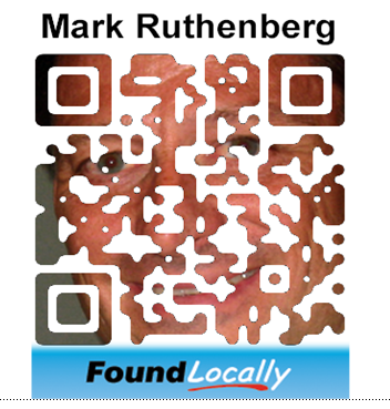
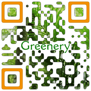
QR Codes are those square graphics, typically black and white (example above), that can be scanned by a smartphone using its camera, which redirect users to a website or a message (example below). There is not need to QR code to be boring square, or to be just black & white. We’ve done a numb er of QR codes in all sorts of colours and designs for Calgary companies
Examples of effective QR Codes:
- A realtor can have a QR code for a specific home on their “For Sale” sign A store can use QR codes as shelf tags to send in-store shoppers to their website form more product info You can have QR codes on your door out, to encourage users to post reviews on sites like Yelp, FoundLocally.com, Google-Business, and TripAdvisor.com. A billboard can have a link to your website, A magazine ad can have a link to the webpage about the product advertised.
We have worked with various companies to create smart innovative and unique QR codes that reflect their corporate personality:
More QR Codes, see TransCanada FoundLocally’s Pinterest page


Responsive Website Design Portfolio
Some Responsive websites in our portfolio:
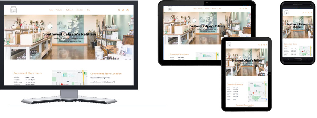
Use It Again Refillery is a Calgary-based refillery/retailer selling a variety of "green" products that are artisanal, ethically- and locally-sourced many of which are carried in bulk and refilled into…
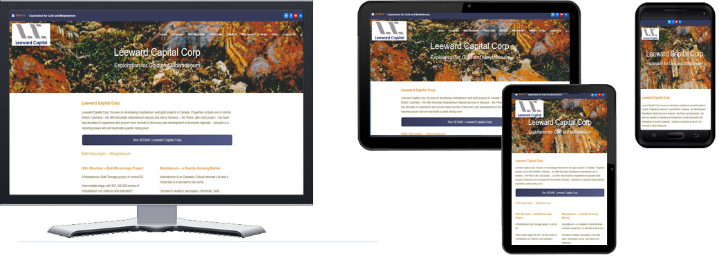
Leeward Capital Corp is an unlisted Canadian junior mining exploration company incorporated and registered in Alberta, British Columbia and Nunavut with headquarters in Calgary, Alberta. The company is planning to…
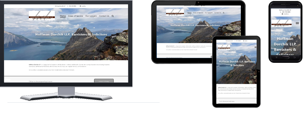
Hoffman Dorchik LLP is a 40 year old Calgary-based law firm that had a simple problem: they could not be found online. A referral from another client, we identified their…
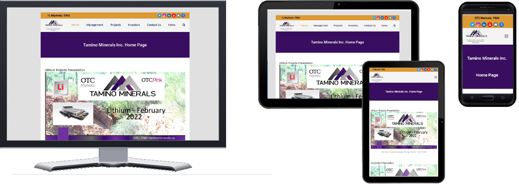
Tamino Minerals is a Mexico-based company, Junior Gold & Silver Exploration Company that seeks to explore the Amalia, Porfido & El Volcan Properties in Northern Sonora. The company is public…
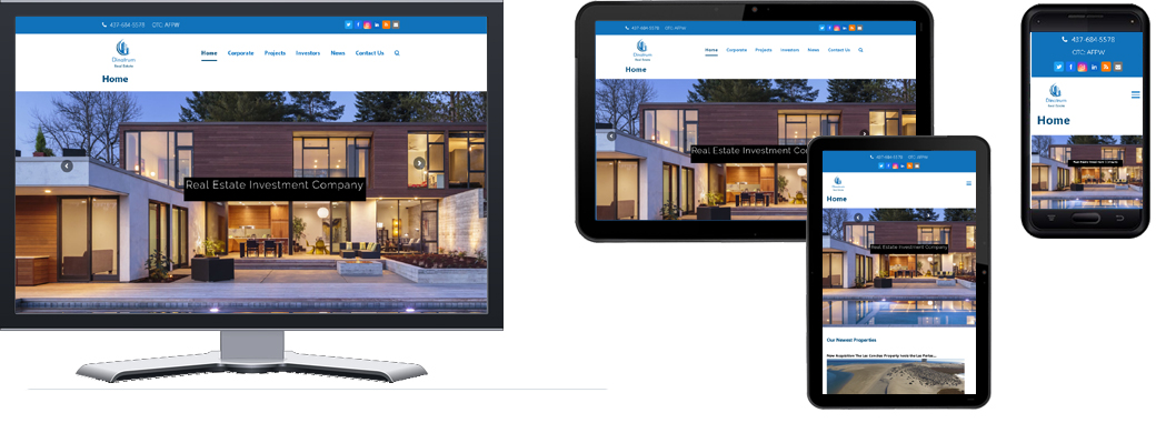
Canadian North Resources - Responsive Public Company Website Dinatrum Real Estateis a property administrator based in Canada with properties in Mexico, Canada and the United States. The company is public…
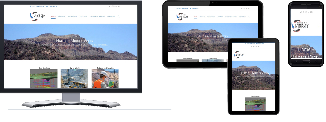
Minera Virray S. de R.L. is a Mexican geological consulting service company in is based in Hermosillo, in the Mexican state of Sonora, with its corporate head office in Huntsville,…
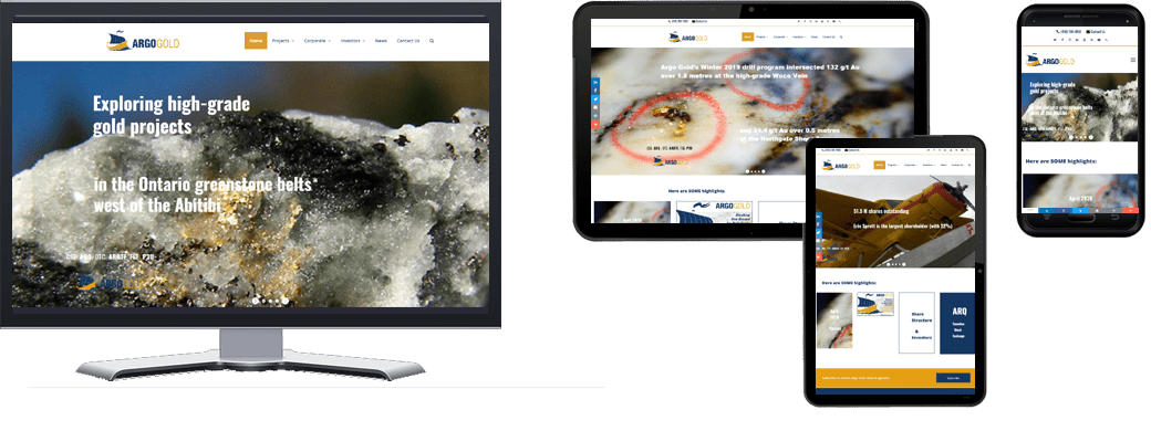
Argo Gold is a publicly-traded mineral exploration company, traded on the Canadian Stock Exchange (ARQ), the OTC Markets (ARBTF) in the US, and on Frankfurt (P3U) and BBerlin exchanges (A2ASDS) …
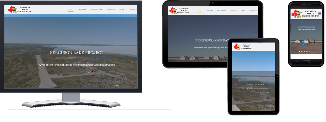
Canadian North Resources is a Mississauga-based company, developing a mine in Nunavut, near Ferguson Lake (west of Rankin Inlet) that has high-grade Palladium, Platinum, Rhodium and Copper, Nickel, Cobalt potential…