Updating Your E-commerce Presence
E-commerce can either supplement the sales of a bricks & mortar business, make the customer process easier for their customers, or indeed create a business selling only online to a specialized but geographically diverse market. FoundLocally has clients who fall into each of these three groups.
If your business sells online, you need to stay on top of current trends, or at least not fall noticeably behind. Because if you dont, your COMPETITION will.
Older e-commerce sites have a lot of catching up to do, especially those custom-built, or that that have their engines dating back to the 1990s or early 2000s.
They suffer from a couple of important shortcomings:
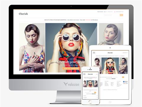
- product images are too small, not zoomable, and not showcasing details like fabrics and finishes
- unable to sell related or add-on products, like a retail store salesperson might
- inability to mass-upload product info, like from an Excel spreadsheet or supplier invoice/bill of lading
credit card processing is cumbersome and possible less/not secure - form-based SEO optimization to improve your “organic” (free) rankings on search engines
- no mobile, tablet, or “responsive” interface (more on this later)
- lacking point & click integration with Facebook, ebay, or Amazon stores to broaden your audience
- automatic calculation of shipping costs and preparation of shipping labels
- back office provides less flexibility for displaying product details, uploading images, YouTube videos, updating shipping options, and adding product categories, and general info (like product care, policies)
- back office provides less robust reporting of sales, categories, customer distribution
Dedicated e-commerce platforms that have benefit from having tens of thousands of customers from around the world, competing to have the best interfaces, templates, and back offices, that an in-house solution cannot hope to keep up with. Using one of these platforms will keep you UPDATED as they continue to make improvements in their underlying technology.
Today, half of searches are done on mobile devices, and according to MailChimp and Constant Contact over 2/3 of emails are read on a mobile device. If your site is not mobile-friendly, your customers will click on an email link, or a search result on Google, Bing (on iphones) or Yahoo (on Mozilla browsers) and get a visually unsastisfying result… and they quickly move to the next search result, hoping to get a mobile-friendly product display.
To reach a mobile audience you can have two approaches:
- a separate mobile site that auto-detects a visitors browser/device and sends them to the mobile site for smartphones and your desktop site for tablets, laptops, and desktop PCs.
- A “responsive” design that dynamically changes as a screen width changes, using multiple stylesheets, that kick in for different screen sizes.
A mobile design with auto-detection is fast way to provide your clients a way to access your store and website on their devices, and may require less work, especially if your back office is working for you. A responsive design is a bit trickier –it helps if you are starting with a good—and well-documented—template, but means you are only updating one website (not a big advantage in e-commerce, where most of the site content is database-driven anyway).
You also need to develop better integration between your email campaigns, your social media, and your websites. Each by itself requires effort (some say a “pain in the ass” effort), but with proper integration and synergies, can start to bring you a solid pay-back. And with less effort than before. That’s whey e-commerce that has built in Facebook integration (for example) can make your life much easier, and help drive both word-of-mouth “buzz” as well as sales.
I you have questions about your e-commerce site or platform, give Mark Ruthenberg a call
Related Posts